CASES
Agency Care Home WordPress Design System No-Code

How a Solo Designer Built a 9-Page Care Home Website in One Session

How a product designer used WPCursor to build a complete 9-page care home website — 42 custom widgets, full design system, real content — in a single working session. No code editors. No handoffs. Just conversation.

Step 1: The Challenge

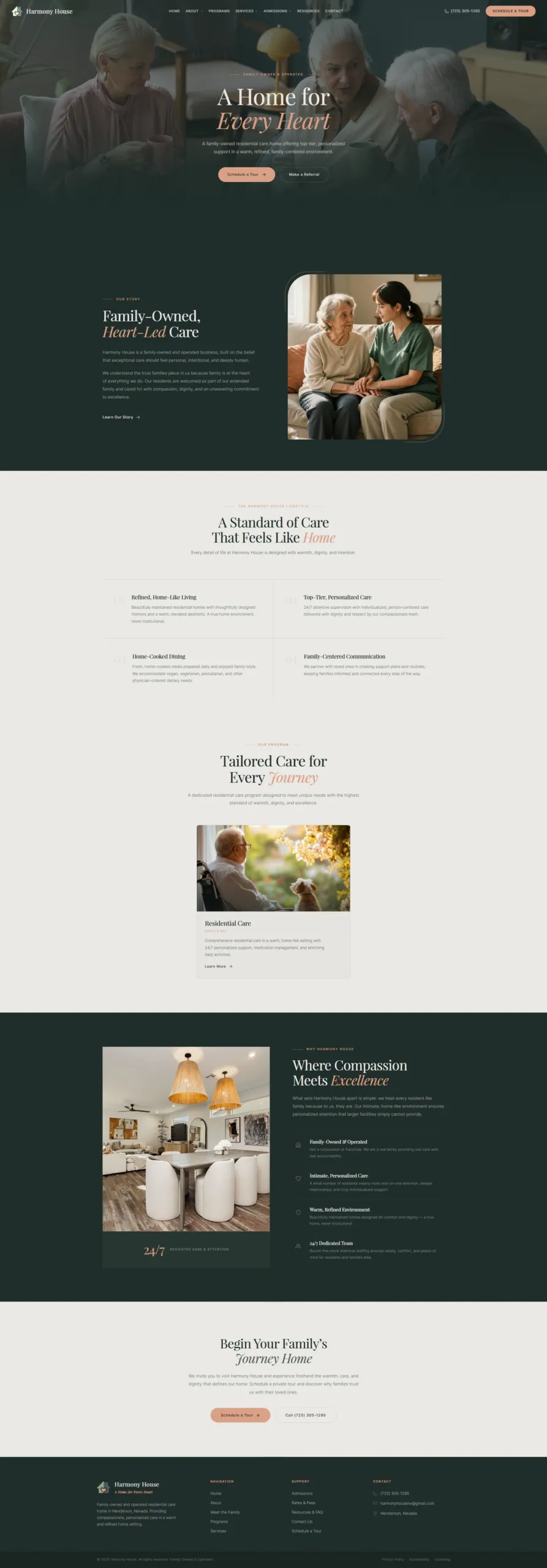
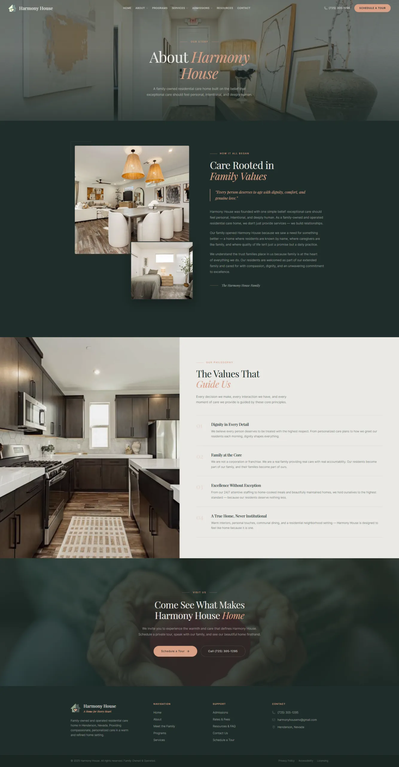
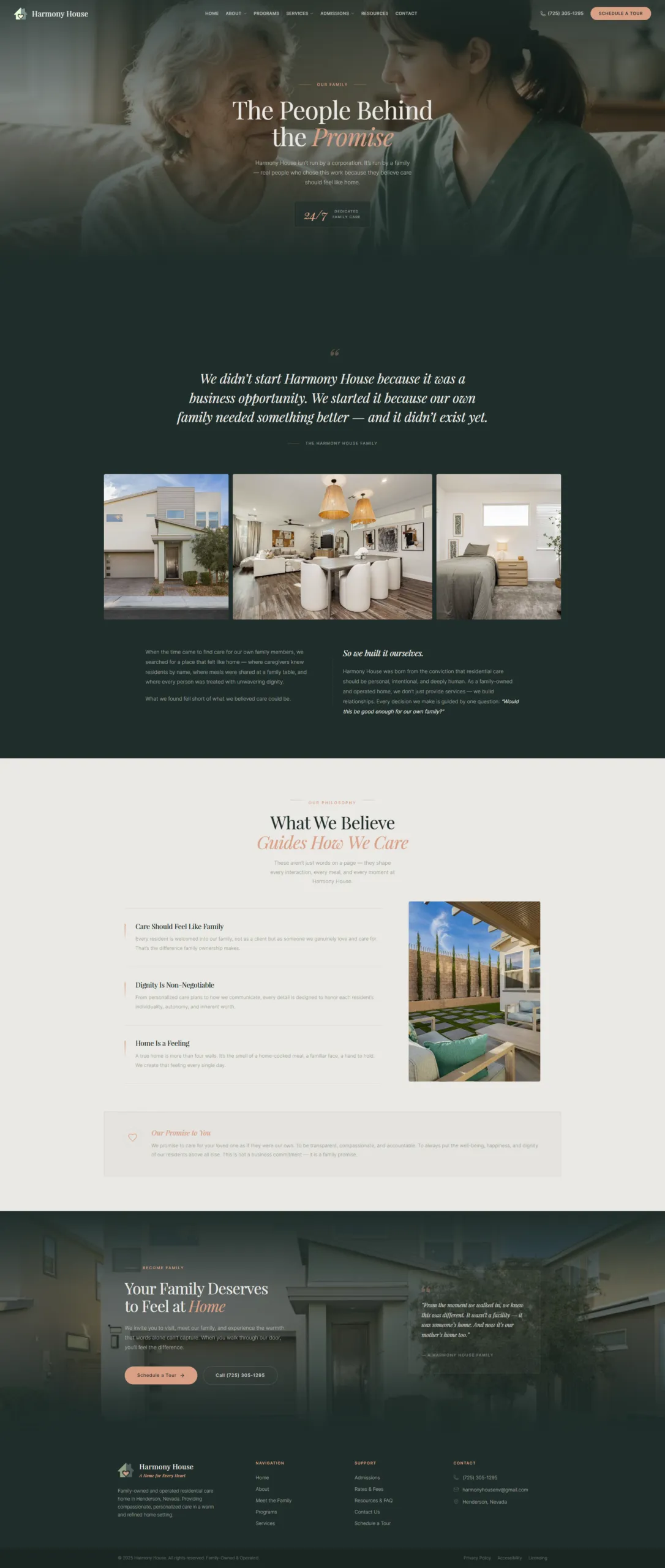
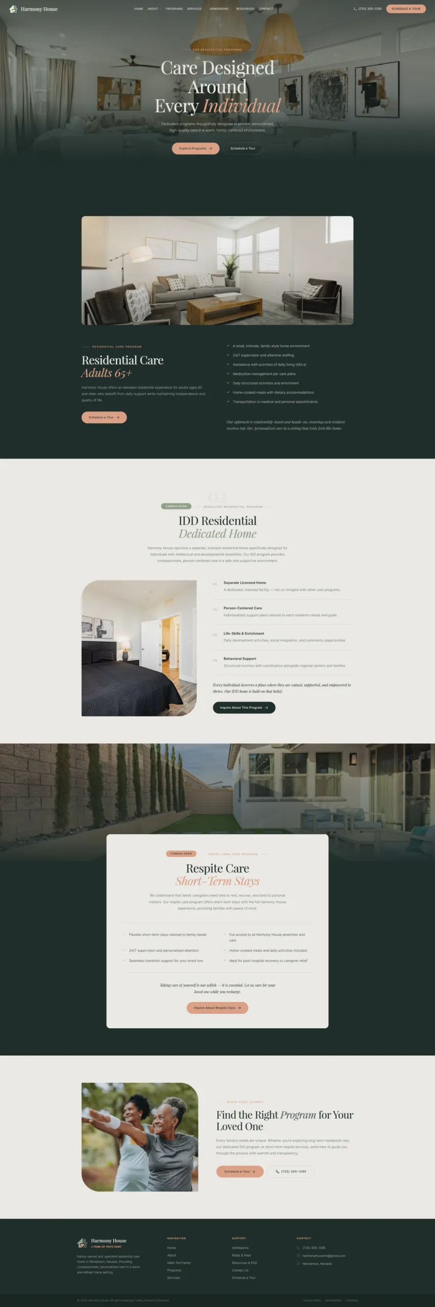
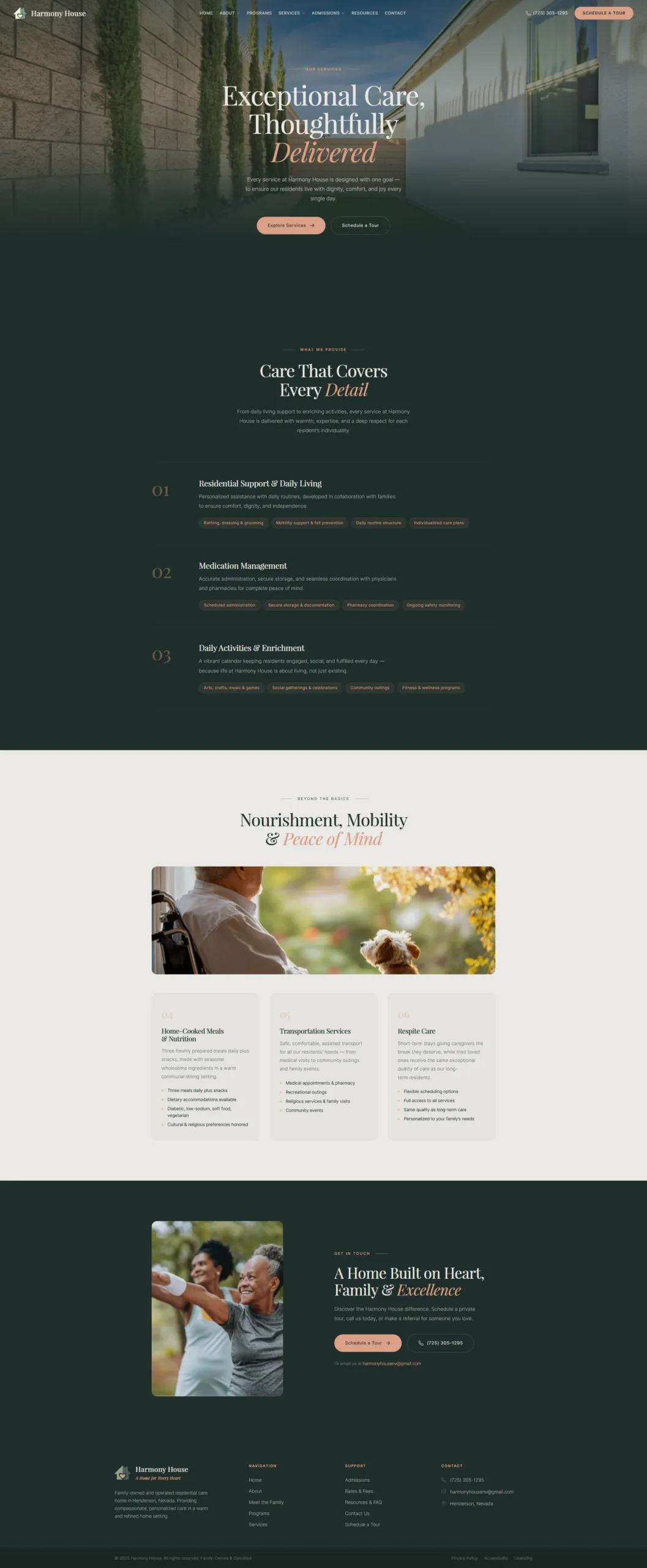
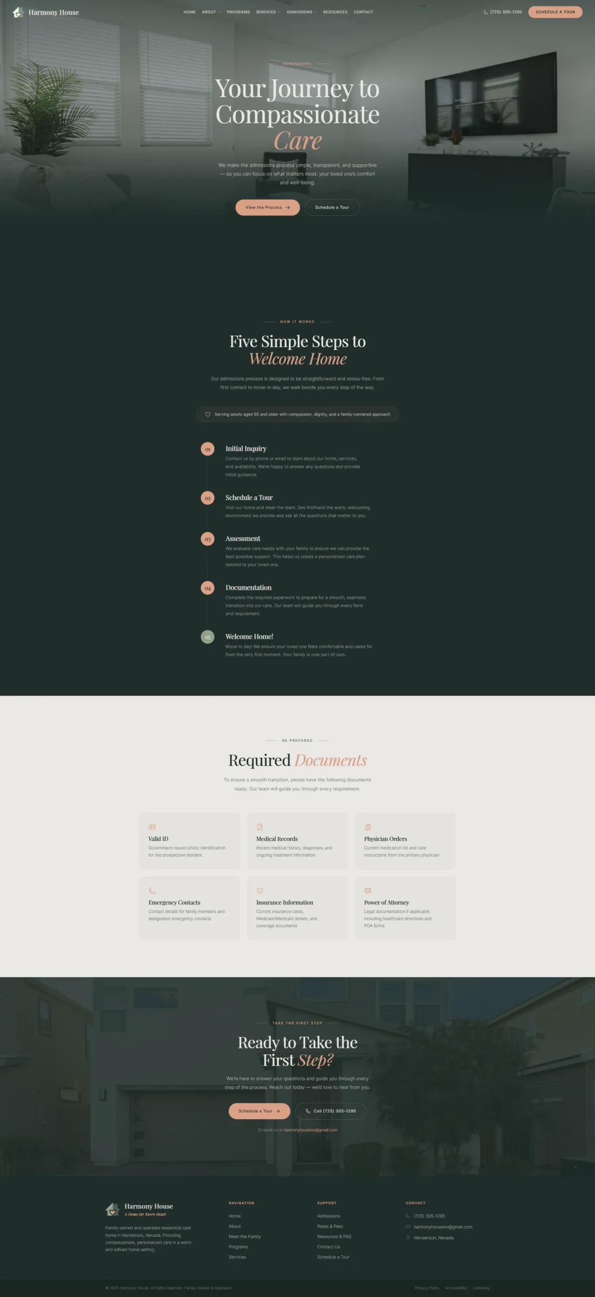
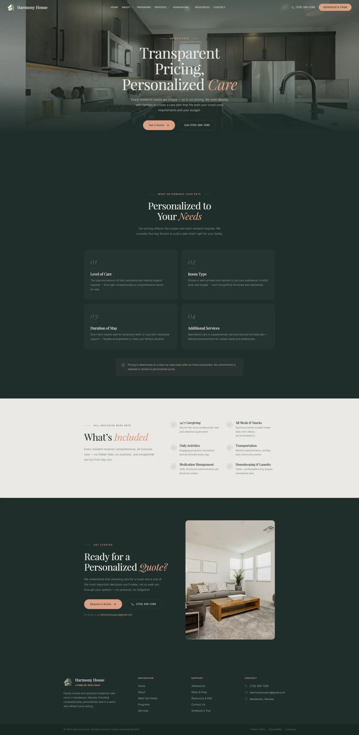
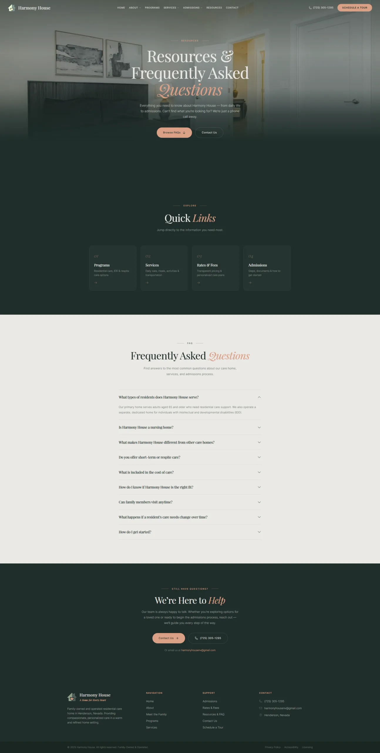
Harmony House is a family-owned residential care facility in Henderson, Nevada offering assisted living for adults 65+, IDD residential care, and respite services. Their tagline — "A Home for Every Heart" — captures a brand built on warmth, family, and personalized attention.

The problem? Their existing website told a different story. It was riddled with dead links, placeholder content, a cluttered layout, and a generic clinical feel that contradicted everything the brand stood for. The client wanted a complete redesign — not a refresh, not a tweak — a ground-up rebuild that felt like luxury hospitality with heart.

To make things harder, the client had already rejected a first design attempt (V1). That version used a teal-navy-gold color scheme with boxy alternating cards — functional, but it read as "healthcare corporate," not "warm, refined, family home." The bar was clear: the next version had to nail the aesthetic on the first pass.

Ali, a product designer running client projects through his agency Pixelabs, needed to deliver a site that was aesthetically stunning — inspired by high-end editorial design, not cookie-cutter templates. It had to be minimalist and sophisticated with generous whitespace, serif/sans-serif typography contrast, and full-bleed photography. It had to be content-complete — 9 pages of real copy, real photos, real SEO — not a mockup. And it had to be built fast — the client was already waiting after V1 was scrapped.

The Challenge

Step 2: Design Foundation

Ali used WPCursor — an AI-powered WordPress development platform — to build the entire site through natural conversation. No code editors. No page builder drag-and-drop. No switching between Figma, a CMS, and a terminal. Just Ali directing the AI, reviewing screenshots, and iterating in real-time.

Before building anything visible, the foundation phase covered six critical areas:

Business Research — WPCursor visited the existing harmonyhousenv.com, analyzed the business model, identified the three care programs, mapped the target audience (families, case managers, regional centers), and documented current site problems.

Content Ingestion — Ali provided two client PDFs: a 30-page Website Outline with finalized copy for all 9 pages, and a 13-page SEO document with meta titles, descriptions, and wireframe notes. WPCursor read and internalized every word.

V1 Autopsy — Rather than starting blind, they reviewed the rejected V1 site together. WPCursor identified exactly why it failed: clinical color scheme, boxy card layouts, no emotional warmth, generic footer. This became a checklist of what not to do.

Design Direction — Ali shared a Dribbble reference (Emerald Fairways Golf Club by Phenomenon Studio) that captured the aesthetic the client wanted. WPCursor analyzed all 5 design images in detail — extracting patterns for typography, color usage, section structure, card design, navigation, and overall mood.

Brand System — Ali provided the new color palette and logo. The five brand colors were mapped to semantic roles: Deep Forest Green (#1F2D2A) for dark sections and overlays, Muted Sage (#4F5D5A) for secondary accents, Soft Olive (#92A089) for highlights and badges, Warm Terracotta (#DAA086) for CTAs and warm accents, and Warm Cream (#EAE9E5) for page backgrounds. Typography paired Playfair Display (serif) for headings with italic accent words and Inter (sans-serif) for body text.

Theme & Components — All design tokens (colors, fonts, spacing, radius) were codified into a WPCursor theme (harmony_house), ensuring every widget automatically inherits the brand system. 8 reusable component primitives (button, card, badge, avatar, divider, icon, input, link) were initialized as a starter kit, ensuring consistency across all 42 widgets.

Time invested in foundation before building anything visible: substantial — but this prevented rework on every subsequent page.

Design Foundation

Step 3: Building the Home Page

The home page defined the design language for the entire site. It was built section by section, with Ali reviewing browser screenshots after each one.

The Hero Section featured a full-viewport video background (three seniors chatting over tea), dark gradient overlay flowing from top to bottom, centered Playfair Display headline with terracotta italic accent ("A Home for Every Heart"), and two CTA buttons. The gradient was tuned so the transparent header navigation remains readable, and the bottom merges seamlessly into the next dark section. Ali directed: "The gradient ending should make it full green in the next section" — WPCursor adjusted the gradient to reach full opacity at 80% and hold solid for 20%, creating an invisible seam.

The Our Story Section used a dark forest green background with an editorial two-column layout and an AI-generated caregiver image — the original entryway photo was too generic, so Ali approved generating a warm care moment via ImagineArt.

The Lifestyle Section featured a numbered editorial grid (01-04) covering Personalized Care, Home-Cooked Dining, Activities, and Family Partnership. The Programs Overview showcased three tall photo cards for Assisted Living, IDD Residential, and Respite Care. Why Harmony House used a split layout with property exterior photo and four differentiators. A CTA Band completed the page with "Begin Your Family's Journey Home."

After the initial build, Ali pushed for more. The sections were functional but felt "cookie-cutter." Ali shared a second Dribbble reference (Sol Haus Premium Interior Design Studio) and asked WPCursor to research additional references. The result was a complete diagnosis: "All sections follow the same rhythm — label + serif heading + body text + equal card grid. Same dark green background, same spacing, same formula. No visual tension."

This led to a redesign of the home page with more varied layouts — asymmetric compositions, dramatic typography scale shifts, staggered photo arrangements, and alternating background rhythms. The conversation between Ali and WPCursor wasn't "build it and ship it." It was a genuine creative collaboration with real-time iteration.

Building the Home Page - screenshot 1
Building the Home Page - screenshot 2
Building the Home Page - screenshot 3

Step 4: Every Page Gets Its Own Identity

A strict design rule emerged from the home page experience: no two pages share the same layout pattern for similar content types. Each page's hero, content sections, and CTA were intentionally differentiated.

The Home page used a video background hero with centered text, editorial numbered grids, and a cream centered CTA. About got a full-bleed photo hero at 65vh, dark two-column layout with stacked images and pull quotes. Meet the Family featured a split-screen hero (text + photo), photo strip, and a cream split CTA layout. Programs used a full-bleed hero with anchor cards and offset overlapping cards that alternated directions.

Services, Admissions, Rates & Fees, Resources, and Contact each followed the same mandatory structure — full-bleed photo hero with dark gradient overlay, immediately followed by a full dark section, then alternating cream/dark backgrounds — but expressed creativity within each section through unique content layouts: service grid cards, step-by-step processes, document checklists, accordion FAQs, resource grids, and contact form sidebars.

The iterative process was real. Hero gradient tuning required multiple rounds. Decorative CSS pseudo-elements bled past viewport edges causing horizontal scroll. Video background needed a poster image matching the exact first frame for invisible load transition. Ali caught the Programs page drifting from the Home page's type scale and enforced font consistency. Ali rejected repetitive left-right column patterns as "lazy and uncreative." Photo curation required careful tracking of which client photos were used where — and AI generation filled gaps when existing photos didn't fit.

Each correction became a permanent build rule, stored in WPCursor's memory and applied to every subsequent page.

Every Page Gets Its Own Identity - screenshot 1
Every Page Gets Its Own Identity - screenshot 2
Every Page Gets Its Own Identity - screenshot 3
Every Page Gets Its Own Identity - screenshot 4

Step 5: The Results

Everything was built within WPCursor's WordPress ecosystem: WordPress with Gutenberg editor, page-no-title template for full-width pages, WPCursor Theme (harmony_house) with CSS custom properties, 8 reusable component primitives, 42 custom Twig-based widgets, Tailwind CSS v4 for layout/spacing plus theme CSS variables for all colors, Heroicons for inline SVGs, 2 CSS snippets (hide theme header/footer and mobile overflow fix), built-in SEO with meta tags, JSON-LD schema, robots.txt, XML sitemap, and llms.txt, 18 client photos plus 1 AI-generated image and 1 hero video, and Google Fonts (Playfair Display + Inter).

The deliverables: 1 custom theme with full design token system, 8 reusable UI components, 42 custom widgets (all active), 9 content pages (all published), 2 CSS code snippets, complete SEO configuration including meta, schema, and entities, 1 hero video with poster-frame loading, and 1 AI-generated brand image.

The site architecture covered 9 pages — Home, About, Meet the Family, Programs, Services, Admissions, Rates & Fees, Resources, and Contact — with a consistent global frame: sticky transparent header with dropdowns plus full footer on every page. Zero placeholder content: every heading, paragraph, CTA, and meta description uses finalized client copy. All 42 widgets built with responsive breakpoints for mobile. SEO ready with 79.5 average score, 8 semantic entities configured, and all major AI crawlers allowed.

The client's luxury-residential vision was delivered — warm terracotta and forest green palette replacing the rejected clinical teal-navy scheme. Editorial typography with Playfair Display serif headings and italic accent words creates sophistication without pretension. Every page has a unique layout composition — no copy-paste patterns. Full-bleed photography with cinematic dark overlays on every hero section. Seamless gradient transitions between sections. Video hero on the home page with invisible poster-to-video transition.

  • 1 custom theme with full design token system
  • 8 reusable UI components
  • 42 custom widgets (all active)
  • 9 content pages (all published)
  • 2 CSS code snippets
  • Complete SEO configuration (meta, schema, entities)
  • 1 hero video with poster-frame loading
  • 1 AI-generated brand image
The Results - screenshot 1
The Results - screenshot 2

Step 6: Why This Matters for Agencies

A 9-page custom website with this level of design polish typically requires: a designer creating Figma mockups for every page and section (days), a developer doing custom theme or page builder implementation (days to weeks), content entry with manual copy-paste from documents into CMS (hours), an SEO specialist for meta tags, schema, and sitemap configuration (hours), QA for cross-browser testing and responsive verification (hours), and rounds of revision where the designer updates Figma and the developer re-implements (days). Multiple handoffs. Multiple tools. Multiple people. Calendar weeks.

With WPCursor, it was one designer and one conversation with real-time iteration. Ali directed the creative vision. WPCursor handled the execution — theme creation, component architecture, widget development, content placement, SEO configuration, responsive styling, and browser verification. When Ali said "the gradient should flow into the next section," it was fixed in the same conversation turn, verified with a screenshot, and they moved on.

No developer handoff — The designer's intent is implemented in real-time, not interpreted later by a developer reading a Figma file. When Ali said "this looks cookie-cutter," the fix happened immediately — no ticket, no sprint, no waiting.

Design system from day one — The theme token system means brand consistency isn't enforced through documentation or design reviews. It's enforced by the code itself. Every widget pulls from the same color, typography, and spacing tokens.

Institutional memory — Every design decision, client preference, and hard-won lesson was stored in WPCursor's memory. The AI didn't repeat mistakes. When building page 7, it still remembered the rules established on page 1.

Real content, not lorem ipsum — Client copy was ingested at the start and used throughout. No "we'll add the real content later" handoff that inevitably breaks layouts.

Built-in verification — Every section was browser-tested with screenshots before moving to the next. The designer saw exactly what the client would see, in real-time, not after a staging deployment.

Iterative without cost — Ali pushed for a home page redesign after the first version was too uniform. In a traditional workflow, that's a scope change. Here, it was a conversation.

Step 1

READY TO BUILD?

Start your project with WPCursor

Every case study starts with a conversation. Tell WPCursor what you need, and watch your site come to life.